Rebrand · Health & wellness
Case study · 2025
365
Detox
Where wellness meets flavour. A reintroduction for a health-driven food and juice brand — nutrient-packed blends and clean, bold design that makes better living feel premium, in every bite and sip.
Services
Brand strategy · Logo redesign · Packaging · Visual system
Deliverables
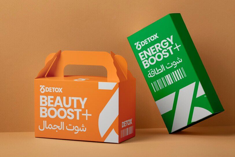
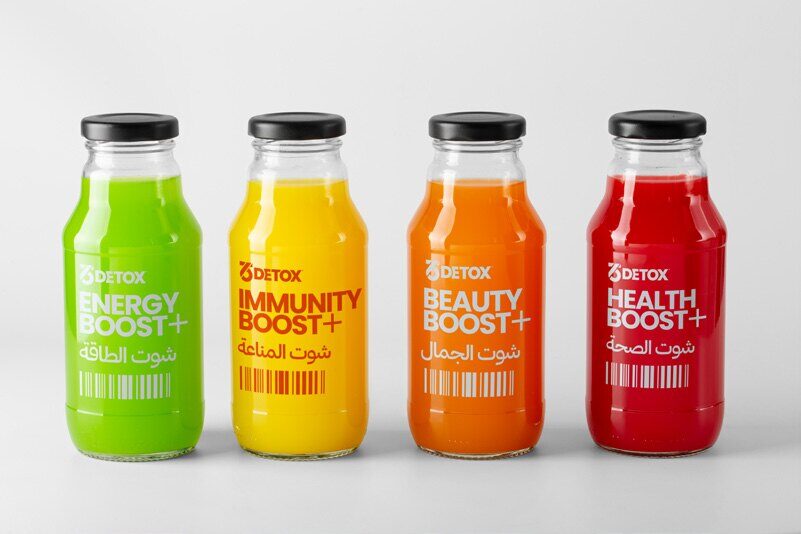
Logo system · Colour palette · Packaging & labels · Brand-in-action
01 — The story
The
challenge
The original “365” felt generic and dated — a literal take on the name that no longer matched the quality inside the bottle. The brand needed to keep its recognition while moving to a premium, health-conscious identity that prints cleanly and scales everywhere.
02 — The story
Our
approach
We preserved the “365” core but distilled it into a unified, geometric mark — clean vitality: refined forms, crisp contrast, and a fresh palette of leafy greens, zesty citrus, and earthy neutrals. The simplified icon works as a bold standalone, while the full lockup keeps clarity across packaging, labels, and social.
03 — The story
The
result
A scalable system built for real touchpoints — from juice bottles and kraft meal boxes to labels and merch — that feels fresh, premium, and unmistakably 365. Recognition kept, perception elevated.
In the wild
The
identity,
applied.