01The ideaGardenia
A café is more than what it serves. It's a pause.
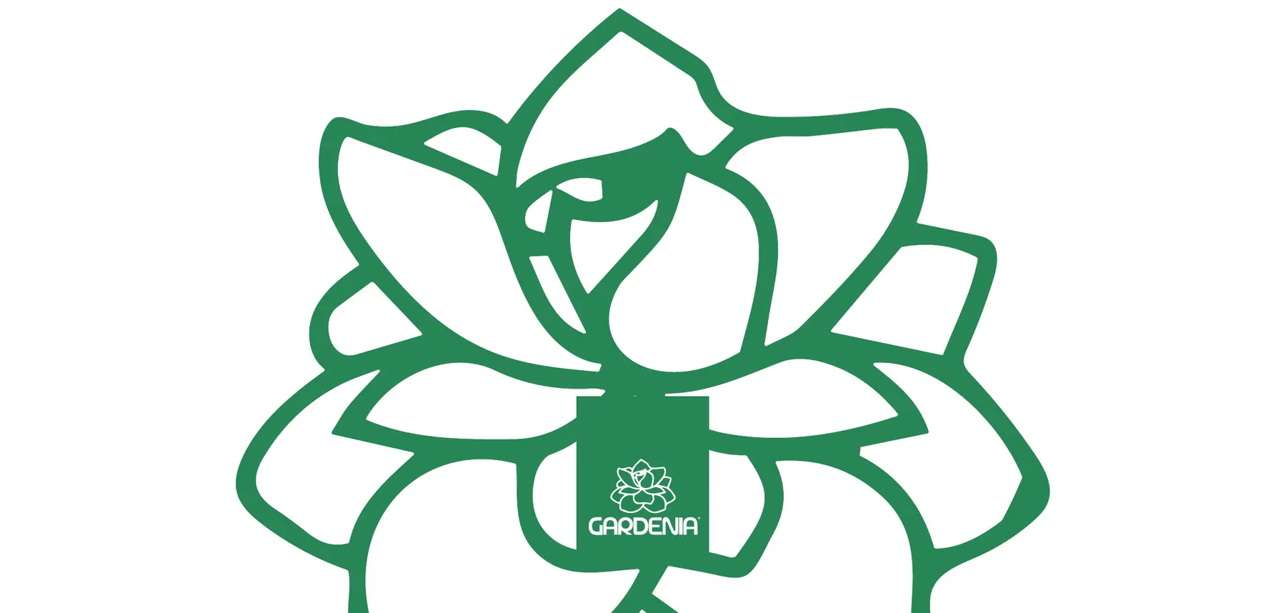
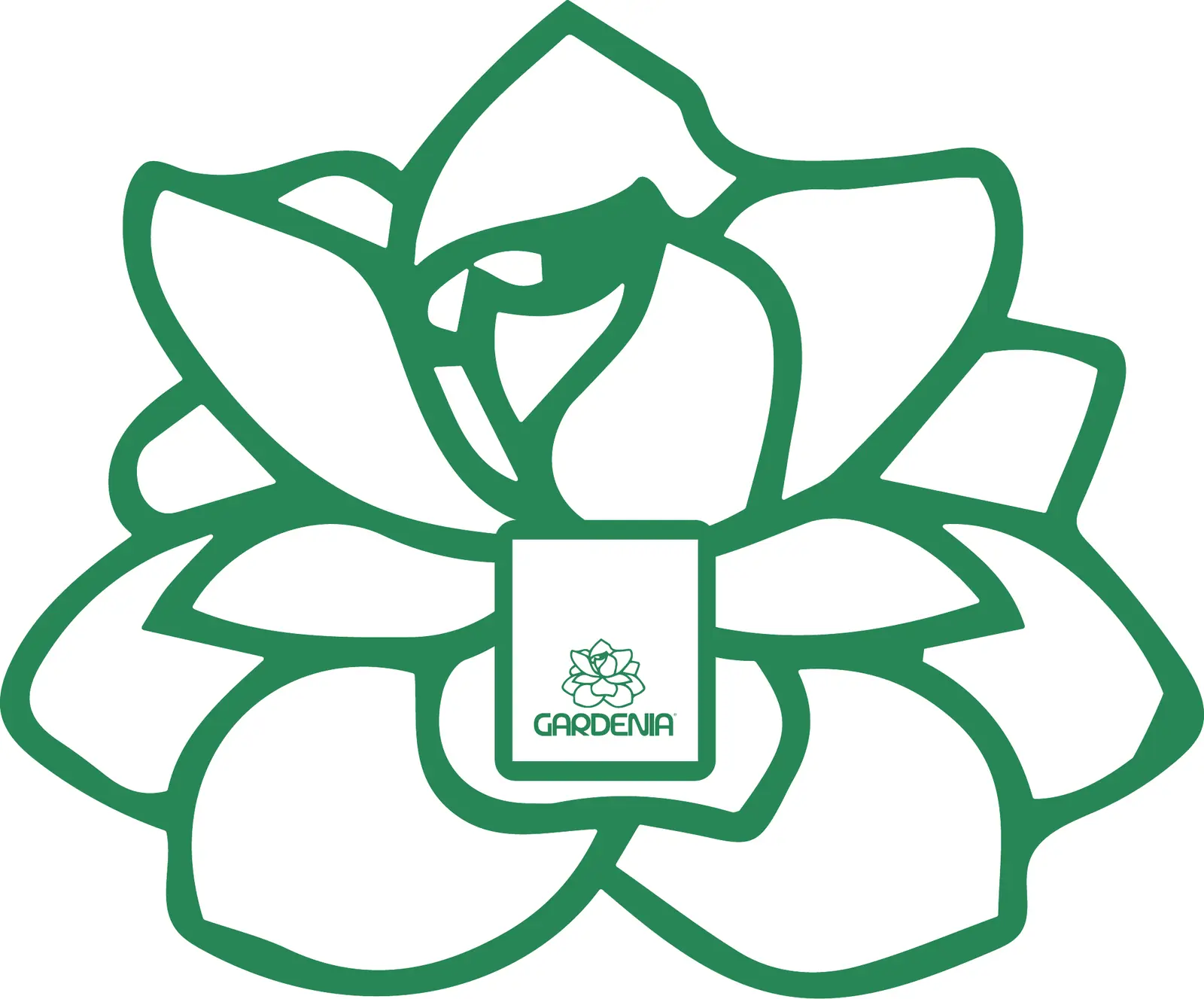
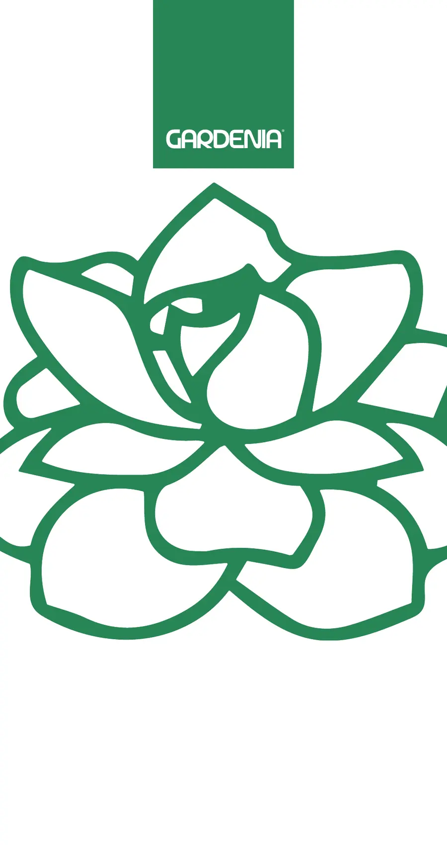
The old badge felt hand-made but lacked structure. It was hard to use small, on one colour, or the same way twice. We kept the flower, drew it again in clean geometry, and gave it a confident wordmark.
- 01Any sizeEasy to reproduce, from a sign to a stamp.
- 02One colourStrong in a single green, or in white.
- 03Stands aloneThe flower works without the name: stamps, loyalty cards, patterns.
02Before / afterGardenia
From a detailed badge to a mark that works at any size.
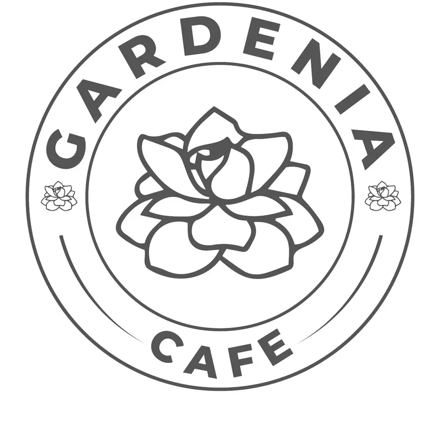 Before
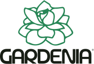 After
03The logoGardenia
Horizontal for signs and packaging, stacked in a green box for labels and bags, the flower alone for stamps and icons.


04ColourGardenia
Gardenia green#018458The brand
White#FFFFFFBreathing room
Deep green#066341
Forest#0D4229
Night#132112Dark grounds
05TypeGardenia
The GARDENIA wordmark is drawn, not typed.
Aa
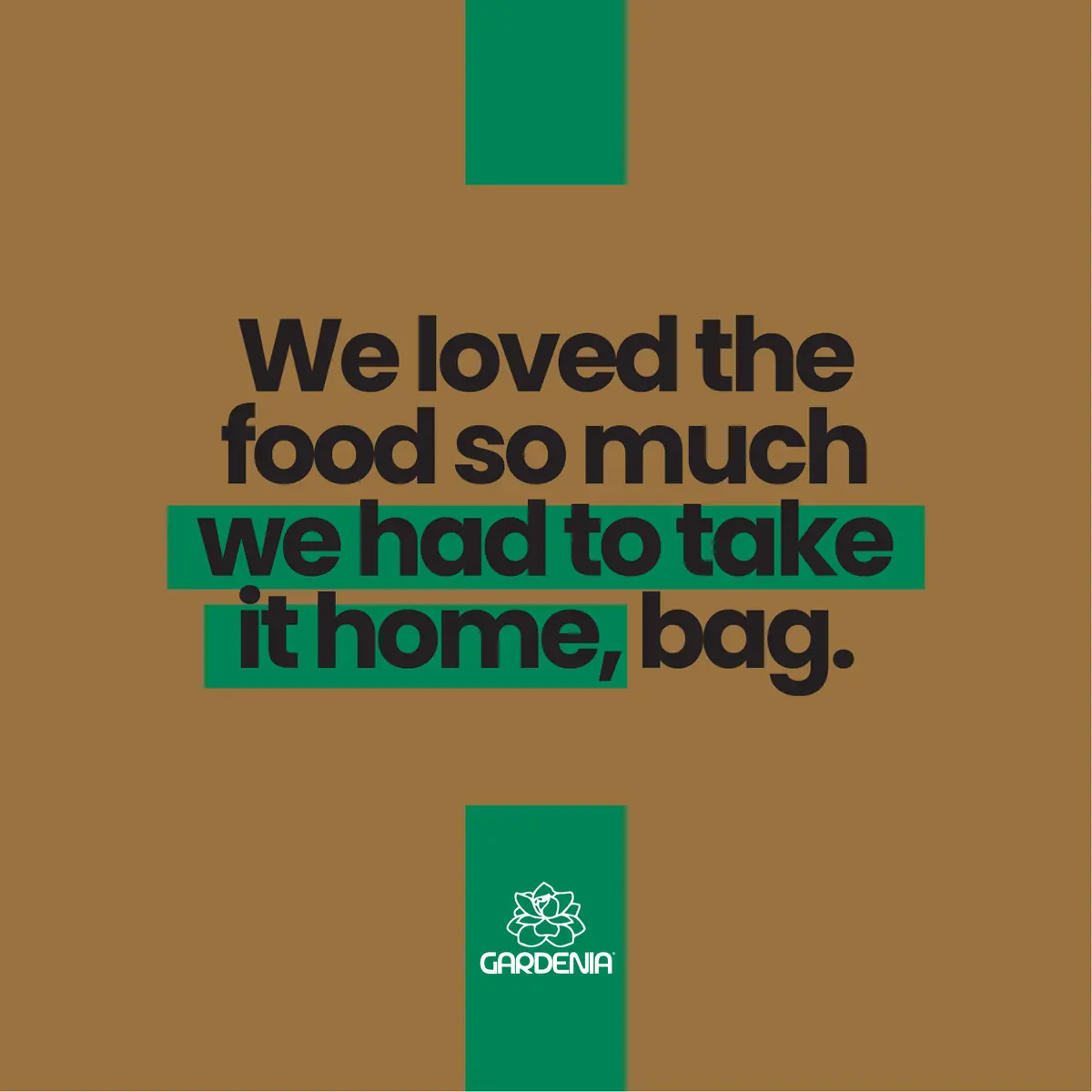
We loved the food so much we had to take it home, bag.
Brand 400Brand 600Brand 800
ABCDEFGHIJKLMNOPQRSTUVWXYZ abcdefghijklmnopqrstuvwxyz 0123456789
06In useGardenia
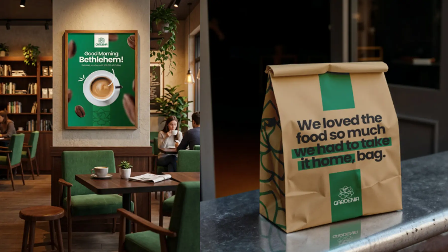
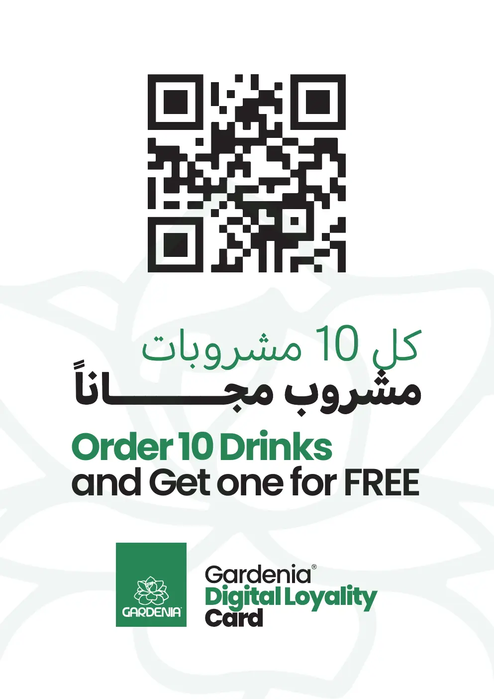
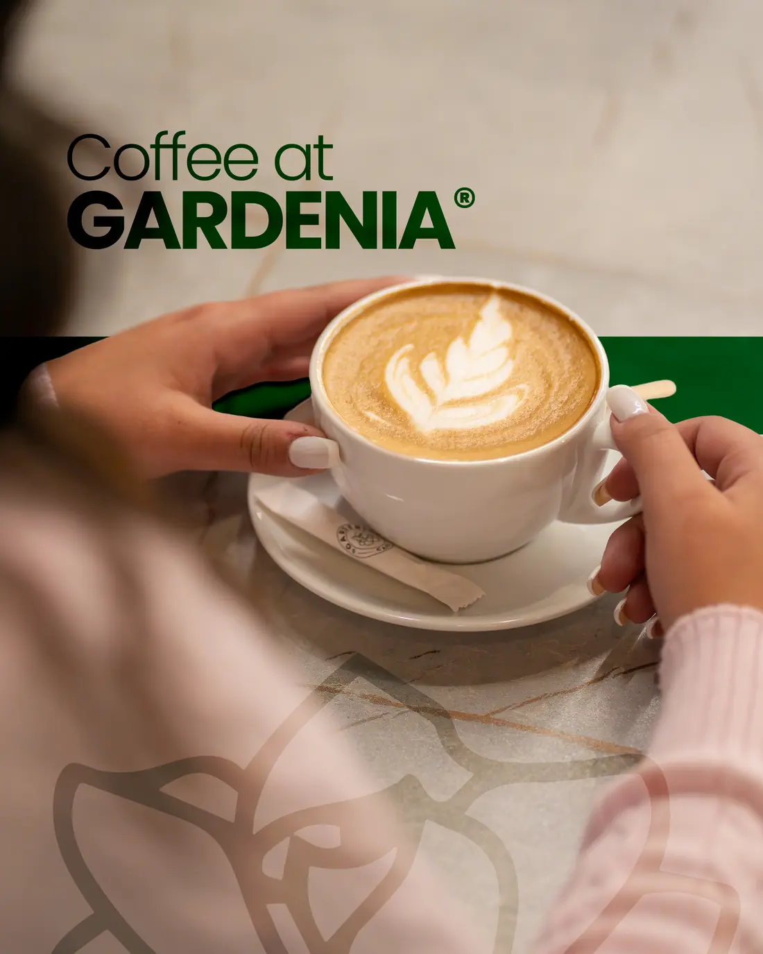
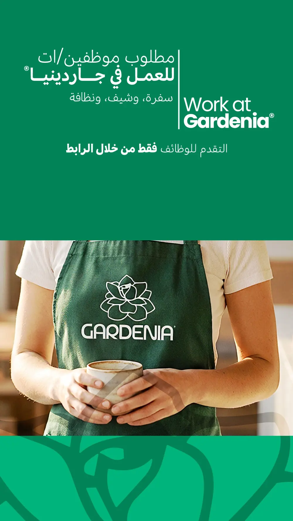
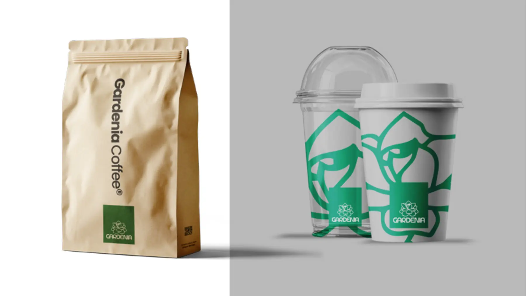
Cups, bags, napkins, the loyalty card, the apron.
Identity by Marker Studio®
What we made
- Rebrand
- Cups & packaging
- Loyalty card
- Menus
- Uniforms
 Baby Basket