Brand identity · Heritage fashion
Case study · 2025
Bint
Al
Balad
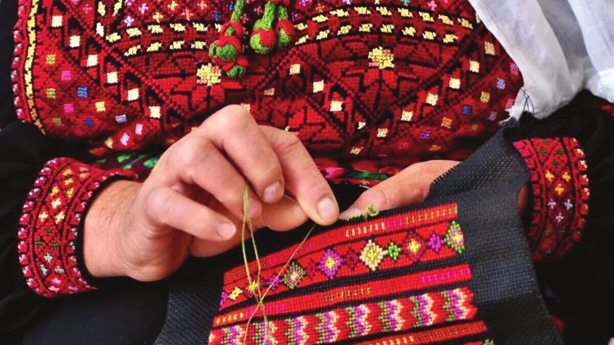
A personal fashion practice rooted in Beit Sahour, where Tatreez is treated not as decoration but as language — Bethlehem embroidery reinterpreted through modern silhouettes, restraint, and a quiet, confident identity.
Services
Brand strategy · Logomark & wordmark · Arabic lettering · Brand guidelines
Deliverables
Visual identity · Logo lockups · Colour & type system · Brand-in-action
01 — The story
The
challenge
How do you carry Bethlehem Tatreez into a contemporary wardrobe without freezing it as costume? The brand needed an identity that honours stitch logic and symbolism, yet reads as modern fashion — heritage as design discipline, not nostalgia.
02 — The story
Our
approach
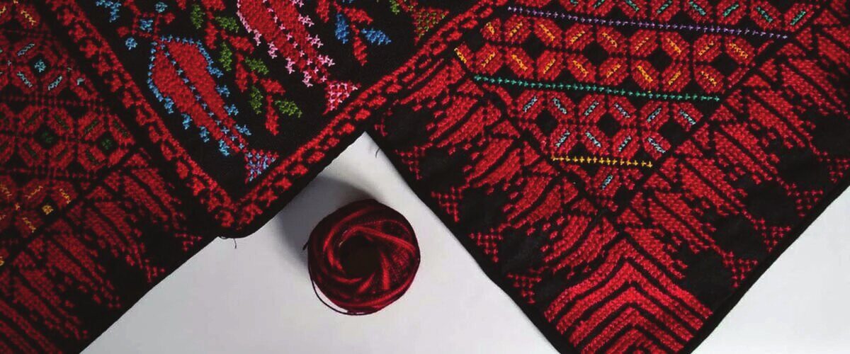
We distilled the Bethlehem flower and star into a single, balanced mark — refined for clarity and structural harmony while keeping its Tatreez logic. A restrained palette of deep reds, warm neutrals, and grounded darks pairs with clean, modern Arabic lettering, so the craft leads and the type never competes.
03 — The story
The
result
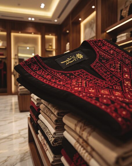
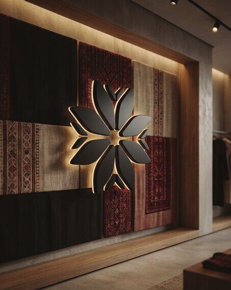
A flexible signature that lives across woven labels, embroidery, packaging, storefronts, and digital — a timeless mark rooted in Bethlehem, refined for today. Fashion that carries memory without becoming costume.
In the wild
The
identity,
applied.