Brand identity · Healthy food
Case study · 2026
BLOK
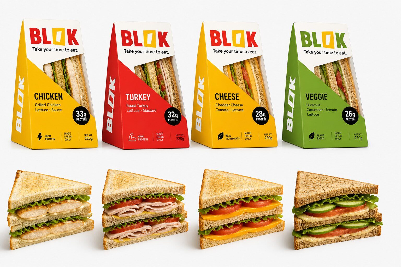
A new way to eat a meal out. BLOK is the answer to the lack of time that stops people choosing healthy food during the working day — a bold, system-built identity made to win on shelf in seconds.
Services
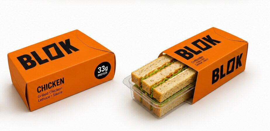
Logo concept · Identity system · Packaging direction · Scalability rules
Deliverables
Logo system · One identity, many contexts · Application mockups · Concept validation
01 — The story
The
challenge
The identity had four jobs: stand out instantly on shelf, communicate without thinking, scale across many products as one system, and feel intentional — never decorative. Every cut, colour, and shape had to earn its place.
02 — The story
Our
approach
We started from a simple block — structure, focus, intent — then disrupted it with a single controlled cut that introduces movement and direction. The result is a forward-moving mark about action: breaking routine, taking a moment, fuelling the day. One system, many flavours, always recognisable.
03 — The story
The
result
A clear, scalable identity validated to stand out, communicate fast, and perform on shelf — a unified system that keeps every product consistent and easy to pick, ready for full packaging rollout.
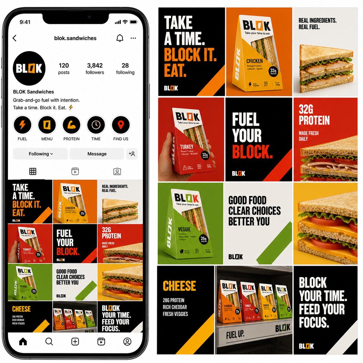
In the wild
The
identity,
applied.