Brand identity · Packaged snack
Case study · 2026
CookieFries®
A packaged snack that reimagines the cookie as a thin, crispy stick — built for the shelf, not the bakery. A bold, mascot-led identity made to win at first glance, in Arabic and English.
Services
Brand strategy · Logo & mascot system · Packaging · Bilingual typography
Deliverables
Visual identity guidelines · Mascot system · Packaging · Brand-in-action
01 — The story
The
challenge
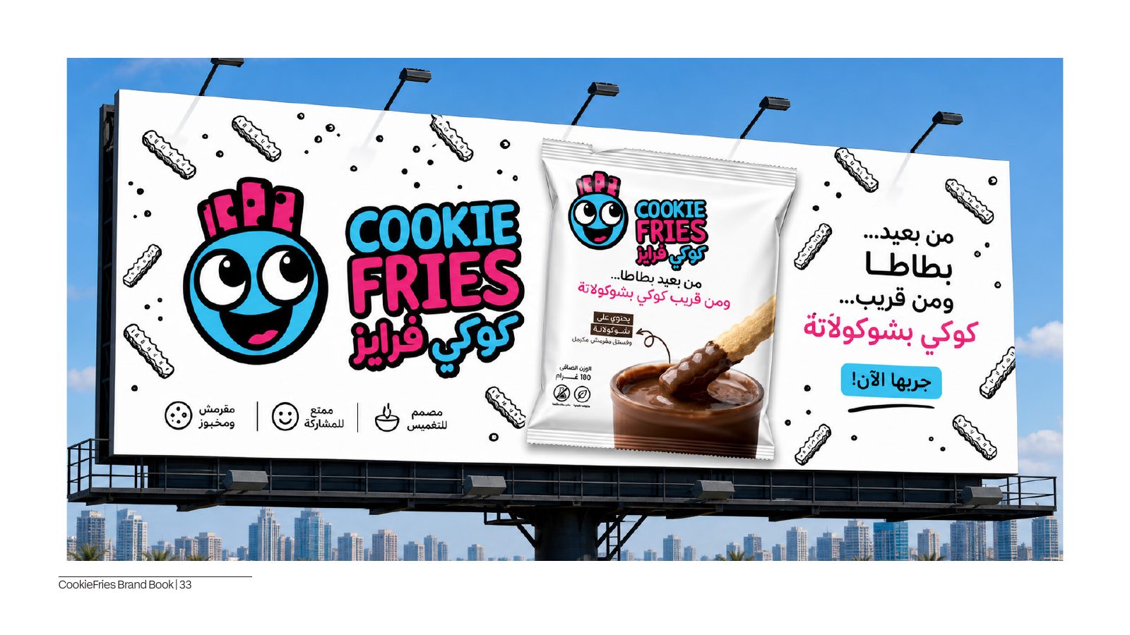
People don't want better cookies — they want something new to try. Cookie Fries had to compete with snacks, not the bakery aisle, and win on impulse: instantly recognisable and instantly readable on a crowded shelf.
02 — The story
Our
approach
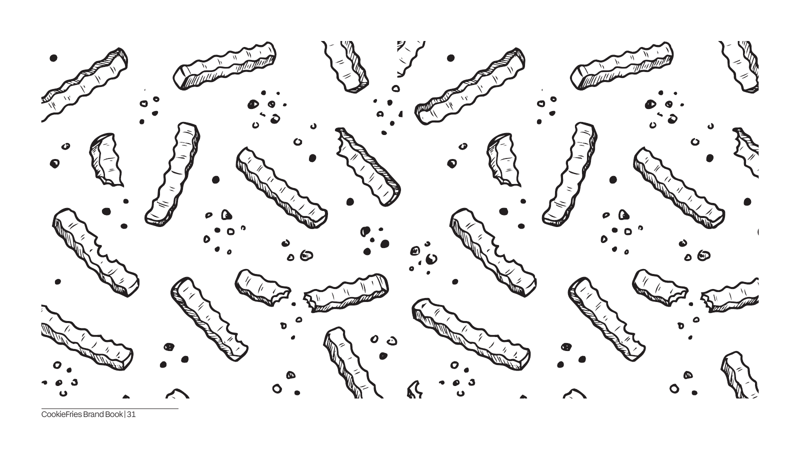
We turned a familiar product into a new behaviour: cookies shaped like fries — easier to grab, share, and snack on. A circular mascot with a fries-crown leads a bold, high-contrast system, paired with a bilingual type voice (Early Sans + FF Hekaya) that stays playful without being childish.
03 — The story
The
result
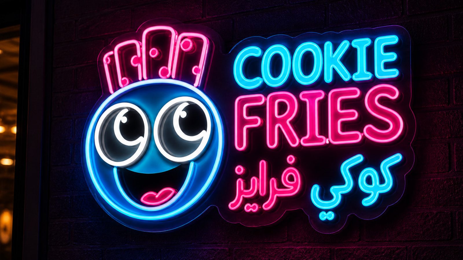
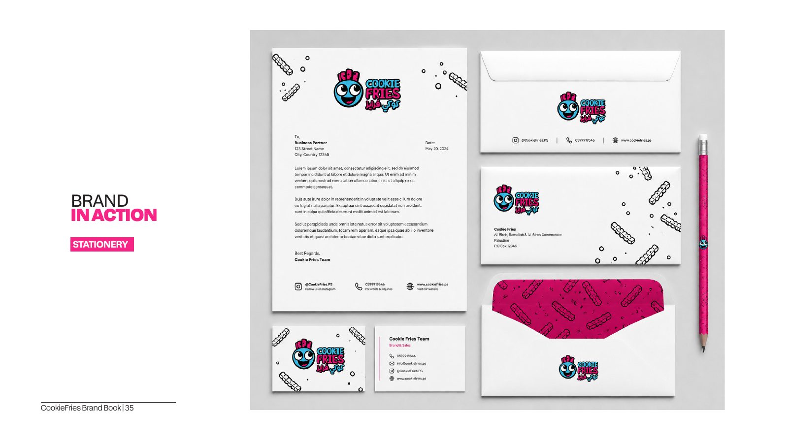
A complete identity that's bold, clean, and instantly readable — from packaging and patterns to a neon storefront and stationery. One playful character, two languages, zero visual noise.
In the wild
The
identity,
applied.